Responsive design is an approach in which a web page automatically adapts to the screen sizes of the device using flexible grid and media queries.
Adaptive design involves the creation of several fixed layouts for different types of devices. When a user visits the site, the system detects his device and loads an optimized layout that matches the resolution of his screen.
| Feature | Responsive Design | Adaptive Design |
| Customization method | Flexible networks, media issues and relative units of measurement are used. | Fixed versions are used that adapt to the device. |
| Customization points | 1 page with different styles adapting to different screens. | Special page versions for different devices. |
| Content type | The content automatically adapts to the screen, the size and layout change. | Different devices get their own version of the content. |
| Device support | No matter what device size, the code will automatically adjust. | No matter what device size, the code will automatically adjust. |
| Performance | May be less effective if the page is overloaded with content. | Can be more efficient as each device gets its own custom version. |
| Development | Once developed flexible design that can be adapted to all devices. | Different versions for each device must be developed separately. |
When to use Responsive Design:
- When it is necessary that the site is easily deployed to all devices, without developing separate versions.
- When the site must be usable and convenient on all devices, from smartphones to desktops.
- If a project requires dynamic content customization, such as if the page contains many different elements that need to adapt.
When to use Adaptive Design:
- When completely different design elements or functions are required for different devices.
- When the site must be optimized for different devices to reduce network load.
- When a project requires different user interfaces for different platforms (e.g., a mobile version with features that desktop computers don’t have).
Example of (Responsive design) :
@media (max-width: 768px) {
    nav ul {
        display: block;
    }
}
Example of (Adaptive design) :
@media (max-width: 768px) {
    body {
        background-color: #e1e1e1;
    }
}
@media (min-width: 769px) {
    body {
        background-color: #f4f4f4;
    }
}
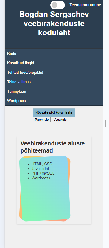
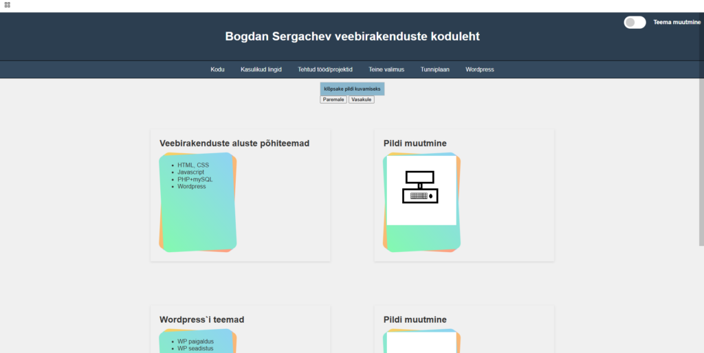
My homepage:
On PC:
On mobilephone: